My dataviz for Warlords
This post is the second episode of my Age of Empires 2 tournaments series (have a look at my first one if you missed it). All work done here concern the main event (it is what interest me the most in tournaments).
Here, the two main colors I picked from the logo result in more pleasant dataviz (at least to my point of view). This time, I improved my dataviz on the following aspects:
- use a better font (here Nimbus Sans);
- avoid titles in my graphs, as we have them in Reddit post and on this blog;
- integrate logo of the tournament inside each visualization:
- integrate information about the data used (here I only used Liquipedia data, but I might add more sources in future tournaments);
- increase font size to be easier to read (maybe not enough for smartphones, though)
Enough talk, let's look at my work now 😃.
Players achievements#
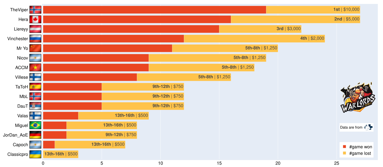
My first dataviz was the one to show the achievements of each player regarding their rank alongside the number of games they won, lost. Here Classic Pro had to forfeit and Jordan had an automatic win. I tried things to illustrate it but was not happy about the result, so it ended with the following one:

Which civilization was played on each map?#
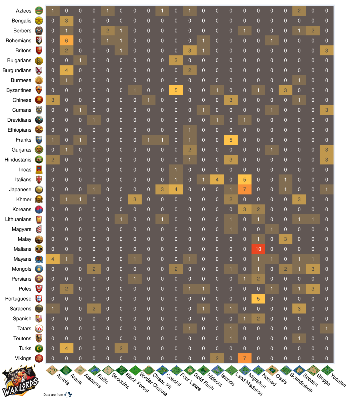
Next, we have the matrix of which civilization was played for each map. In this tournament, the civilizations not played on this main event were: Goths, Slavs, Vietnamese, Huns, Celts, and Sicilians. Here we have a huge matrix as we have more maps compare to Red Bull Wololo Legacy. It is now easier to read it, but the esthetic is not enough for me (maybe next time will be better).

Which maps were popular?#
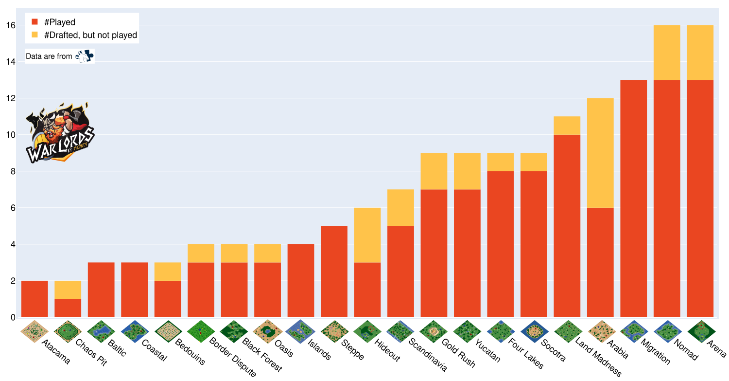
This one got more attention from people compared to the one from the previous tournament. I think it is due to the way I sorted the abscises, but also because the map pool is big enough to require such visualization to better understand what happened.

Kill/death of each civilization played#
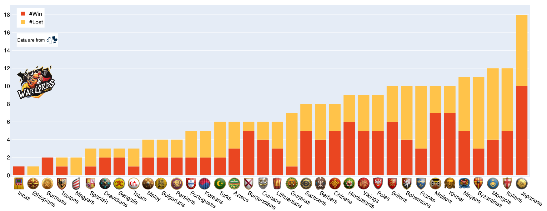
Here, as for the visualization above, I sorted the abscises with the amount for game played. I think it is better than sorting them alphabetically. Some asked for the win rate, while it is understandable for civilizations played more than 10 times, I am uncertain if it is good for the other case. I still love the discussions it generates 😄. Even so, I plan to work on this one to improve its quality.

The wheel of victory#
Finally, the wheel of victory! Compared to last time, I did not publish a png one on Reddit. It is an exclusivity for those reading post 😉. As I wanted it to provide additional information compared to last tournament (also as the map pool is huge), I opted for an interactive visualization. The result is less pretty than the previous from Red Bull, but I hope you will enjoy it. You can hover each segment with your mouse to gather information, and even click on categories to look at a specific map or category of map (click on the warlord logo to go back). Don't hesitate to give me advice to improve this work.
What is next?#
I want to gather more data using different sources to complete or create new data visualizations. For now, I will focus on captain mode data, and if you know API I can use, feel free to comment. Also, if you know contacts I should reach, feel free to share 😄.
The next tournament I will cover is the Grand Melee, the hype is there!
I hope this will help and/or inspire some of you.
See you again, Vincent.